top of page

Overview
ShopKeep merchants use the Register Button Layout page in BackOffice to customize their point-of-sale (POS) layout. However, the existing interface was visually outdated (resembling a ShopKeep iPad from 2014) and functionally limited, making the customization experience frustrating for users.
Our goal was to identify usability issues, modernize the UI/UX, and rebuild the page using React to create a more intuitive solution.
My role
Sole product designer responsible for redesigning the POS register layout page. Partnered with the product manager to define requirements and roadmap, delivering improvements that reduced merchant reported layout issues by 50%.
Team
1 PM, 5 Engineers, 1 Designer (myself)
Timeframe
Design process : 3 weeks
Production : 2 months
Shopkeep
Redesigning Register Layout Page
Modernize ShopKeep’s outdated Register Button Layout page by addressing usability issues and rebuilding it in React for a more intuitive POS customization experience.
Discovery & Research
To understand the current register layout experience, I began with a UX audit and reviewed support tickets that highlighted key pain points, such as button and page limits as well as difficult navigation. The PM conducted interviews with 6 merchants representing a range of store sizes.
Key issues
-
Cumbersome Item Addition Process: Adding items is slow and offers little control over placement.
-
Inefficient Page Management: Page actions are hard to find and require unnecessary steps.
-
Loss of Original Item Name: Editing button names removes the original BackOffice reference, causing confusion.
Interview quote #1
"I sell hundreds of items, but only some are available in my shop. So when I shorten a button name because, you know, the button is small and can't fit everything, it replaces the original name from the BackOffice. And I can’t tell which item it’s for, and it makes it really hard to keep track."
Interview quote #2
"When I first started using this layout, adding or removing pages was really confusing. I’m used to it now..."

UX Improvement #1
Drag-and-Drop Enhancements
To make item addition faster and more intuitive, a drag handle icon was added to each line item to clearly indicate it can be moved. On-screen instruction was included to guide users who may be less familiar with drag-and-drop interactions.
Goal: Improve layout-building efficiency and accessibility for both tech savvy and users with minimal technical experience

UX Improvement #2
Button Placeholder Cues
To give users greater control over button placement, real-time visual cues now highlight the nearest placeholder as an item is dragged over the keyboard panel. Once dropped, a smart snap feature ensures it lands precisely in the nearest valid position.
Goal: To enhanced spatial orientation and provide immediate visual feedback for more accurate placement
.png)
Before

.png)
After
UX Improvement #3
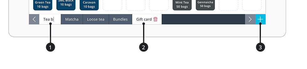
Improved Page Management
Page names can now be edited directly on the tabs, eliminating the need for a separate input field (1). Users can also long-press a tab to delete it (2). The ‘Add Page’ button was relocated to the bottom-right corner, grouped with other pagination actions for improved discoverability (3).
Goal: To streamline interface, reduce cognitive load, and improve discoverability of navigation tools
Before

After
UX Improvement #4
Persistent Original Name Display
The original item name from BackOffice is now always displayed alongside the button name, reducing confusion and helping users accurately identify items. This ensures users can always verify the correct item.
Goal: To eliminate ambiguity when items have similar or slightly different names, improving accuracy in item management
Key UI Improvement
Modernized Look & Feel
I applied the updated ShopKeep color palette and iconography to improve scalability, reinforce brand consistency, and enhance visual clarity.
Goal: To boost user confidence in the tool’s capabilities by modernizing its appearance and ensuring it feels cohesive with the rest of the product family
Testing & Feedback
I created a clickable prototype in Principle and conducted remote usability tests with 5 merchants from stores of varying sizes.
Feedback included:
“The placeholders make it so much easier to know where things are going.”
“Now I don’t have to play guessing games with item names anymore..."
“Way easier than what we had before. Looks more like the actual Register.”
Before

After

Results
The PM conducted follow-up interviews with several merchants who noted the cleaner interface and faster editing experience. Support data reinforced this feedback, showing:
-
40% decrease in merchant-reported layout issues
-
Significant reduction in support tickets related to layout editing
Reflection
This project reminded me that effective design isn't always about reinventing. It's about refining. With access to richer, more actionable feedback from real users today, we’re better equipped to identify pain points and evolve legacy tools into experiences that feel modern, intuitive, and empowering.
Looking ahead, there’s still significant potential to build on this foundation, especially by moving beyond the current register format. With more time, we could explore valuable features such as layout sharing, cross-store syncing, and smart layout recommendations. These enhancements could further reduce setup time, drive consistency, and help merchants get more value from their POS with less effort.
bottom of page